 |
| |
Richie Fahey has talked to MI6 about his work creating
the cover art for the new US editions of the classic
Ian Fleming novels...
|
|
Richie Fahey Interview - Designing Retro Fleming
21st August 2003
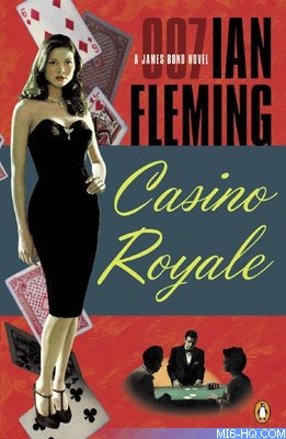
The cover art for the new Penguin USA paperback editions has been
created by New York photographer and painter Richie Fahey. MI6
caught up with him to find out what it takes to create the spectacular
covers and how he creates the retro look for classic Bond.
Designing A Classic
Richie told MI6 about his first work, "Penguin
decided to start with Casino Royale. I read the book,
researched old James Bond covers, and made some sketches.
I gave the
sketches to Roseanne Serra, the art director for the
series, and she presented them to Penguin and the Ian Fleming
estate. Together they chose one of the sketches which
consisted
of: Vesper, nude standing on the left side of the cover;
le Chiffre dealing baccarat with 2 players and with James
Bond in the foreground within a panel in the middle of
the cover; title on lower right and Ian Fleming's name
in the upper right hand corner. However, the Ian Fleming
estate specified that they did not want naked women nor
James Bond on any covers.
With the help of my wife Maria Cristina, who did the hair,
make-up and styling for the series, Vesper was photographed
in a black cocktail dress and James Bond was photographed
with low-key lighting so he could not be recognized. For
le Chiffre, a friend was photographed with my wife and me.
I photographed everything in black and white with a medium
format camera. |
|
 Images used with permission.
 |
From the contacts from the shoot, I selected images and composed
different versions to show to Roseanne. We picked one version
and I made 11x14 black and white prints of Vesper, le Chiffre
at the Baccarat table, and James Bond. I then colored them with
photo oil paints using q-tips and bits of cotton balls wrapped
around a toothpick.
After they dried, I scanned them and arranged them and tried
different type faces for the title and Ian Fleming's name. I
showed this to Roseanne and we chose the type faces that worked
best. Roseanne thought the cover was lacking something. We decided
maybe falling playing cards would be good so I went and photographed,
printed, colored and scanned falling cards.
 |
|
Roseanne showed this version to Penguin and the Ian Fleming
Estate. The Ian Fleming Estate did not like the cover (I
think they really liked the British versions and mine are
very different from them) but Penguin and the Estate were
able to work it out by taking James Bond off the cover.
The rest of the covers would basically go through the
same process and follow the same guidelines we created
from Casino Royale: Ian Fleming in the upper right,
colorful background, panel
in the middle, a female character, the villain and an element from the story
with my inspirations coming from the story and old James Bond covers.
James
Bond would only appear on a couple covers as small and unrecognizable figures
and as the hand holding the gun on the back. I tried photographing the
women naked for the next two covers and the Estate did
not seem to mind. (Honey
is naked when James first meets her)
|
00-Seven Questions
How do you describe your job?
Photographer / Designer.
Where are you based?
New York City, USA.
Where did you study?
I received a BFA at the University of South Carolina and studied photography
at Rochester Institute of Technology
How long have you been an artist?
I have been hand-coloring black and white photos in one way or another
since high school.
Which title was the most difficult cover to conceptualize?
Octopussy
What was the length of time you spent on each cover
beginning to end?
Two weeks to a month
What was it that inspired you to choose your path in
life?
My grandmother and great grandfather were both professional portrait
painters.
|
Visit Richie Fahey's official
website for a look at his series
of covers.
Related Articles:
 Current
Editions - USA